I was having a conversation about how much I love HowStuffWorks podcasts, and I find it remarkable how much I greatly dislike HowStuffWorks.com the website. In fact, I can’t stand it. As it currently stands, pick any page at random and you will see 20 different sidebars or image captions trying to get your attention. Without fail, more “screen real estate” is given to what you aren’t reading rather than what you are. Can you imagine going to Wikipedia to lookup a topic and a mere 11% of the area of screen is dedicated to the subject matter?
Check out this following screenshot, highlighted for fun:
Red = A bunch of bullshit
Yellow = The content you want to read
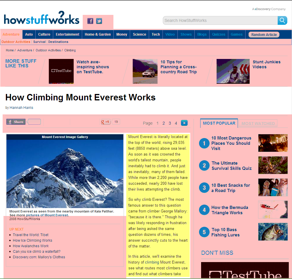
I opened this in Photoshop and did a little measuring. The entire graphic is 999×956 which comes to 955,044 pixels. The yellow area is 215×489 coming to 105,135 pixels. That is precisely 11% of the available screen space dedicated to content–and it is seated well into the bottom of the screen. Even if I included the photograph of Everest into the calculation, we’re looking at something close to 20%.
HowStuffWorks, if you’re reading, you should know that the fundamental reason I have a problem with your website is that it has so little in common with your podcasts. If your website was like your podcasts, it would be robust in content, uncluttered, and related articles would still come along, but they would take a backseat to the actual topic at hand. For example, Stuff You Should Know is your most successful podcast, in my opinion, because of it’s quaint humanity sinuating throughout honest-to-goodness information. This information is delivered in a peaceful one-thing-at-a-time format. These pleasantries are punctuated by Josh’s polite recommendation for further optional reading. This is not so with your website.
Upon taking Josh’s recommendation to come to your website, I am always disappointed by the juxtaposition between what I have just heard and what I am now seeing. I see a website that wants me to click on everything at once and is ultimately disrespectful to the type of person that would otherwise enjoy your content. If I can get one point across it is that my reaction to your current site design is a visceral one. I just naturally want to close it because I find it so unpleasant. It takes willpower to remain on your site and read. I want to like the site so much, but I can’t until you show more respect to your content.
Now, I realize you are using a content management system and that’s just what it does, but it is time to make a change, declutter, and gain some respect from your potential readers. Oh and one more thing: Please stop breaking your articles into so many pages. I find it irritating and I’m sure others do as well. I remember in the past you had a table of contents for each article so you could skip around intelligibly. That was preferable.